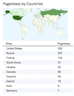
If you aren't a regular consumer of your Blogger stats, please read this entire message and check out the photos. There is always some rather interesting and even slightly bizarre information in that stats. First, I have always been a big supporter of the map. It is one of my favorite ways to see where traffic is coming from, but the numerical break down by country is also useful. It can really make you start to question, why? Why is traffic coming from there? For example, why so many readers from Russia? I don't offer any content in Russia, so why the traffic. Recently I added an ad campaign for my site, because Google Adsense was offering a free month. BOOM! I suddenly get super popular in Russia -- click farms for sure.
The next piece of information that is always compelling to me are the what browsers and what operating systems. How in the world is 34% of the traffic coming from Internet Explorer? Seriously? Why would someone still be using it? I mean I know it is popular here in Korea, but only 57 viewers to my blog were from Korea, which means another 416 people from other places were using it. Strange. I dumped that browser years ago and I'm not going back people. Seriously folks, join the rest of us on Chrome and Firefox. I'm not surprised by the 65% from Windows operating system. Disappointed, but not surprised. I'm disappointed because that many people still opt for an inferior product, but I guess that is life and it explains the Internet Explorer situation.
Beyond all of that, there is something else noteworthy here -- look at all the data they have on you! They know where you are, what type of device you are using, and what type of browser... Privacy? That is a dead concept gang!


No comments:
Post a Comment